
We are influencers and brand affiliates. This post contains affiliate links, most which go to Amazon and are Geo-Affiliate links to nearest Amazon store.
History changed when it was discovered, in early 2014, that mobile Internet usage exceeded desktop Internet usage. Google even released a mobile-friendly update which is also called the Mobilegeddon. This has made businesses and brands to create and develop websites that will provide better browsing experience to mobile users.
With innovations such as automatic font size adjustment and pinch-to-zoom, modern browsers have managed to offer an optimized user experience. It is important to make sure that a website is mobile friendly when it is being designed and developed. However, sometimes it can be hard for you to make your website more bearable to mobile users when you are on tight budget or don’t have enough time. So what are some of the things that you can do to make your website more mobile-friendly?
HOW TO MAKE SURE YOUR WEBSITE IS MOBILE-FRIENDLY
Use standard fonts
When it comes to mobile devices, the size of the font and the buttons are vital. Adjust your font size so that it will be legible on mobile devices. You will make it easier for mobile users to read your website content easily. They won’t have to struggle zooming to see anything. Also, it is very important to make the buttons a little bigger so that users won’t hit the wrong ones accidentally.
Take out the default zoom
Auto-zoom can make the content of a website either too small or too large which can really mess up the website layout. This problem is always prevented by using the viewport Meta tag to set up custom variables just within the content.
Choose high-resolution images
Using high-resolution images ensures that user experience is of a higher standard. This is because it will help avoid having pixelated or blurred images when the images are viewed on high definition screens. Therefore, you should ensure that your images have a maximum width so that they are resized when they seem bigger for the screen.
Use YouTube videos on your site

You can use YouTube videos to deal with any issues that arise when viewing videos on a mobile device. This is because the embed code on YouTube is normally responsive already which saves you time.
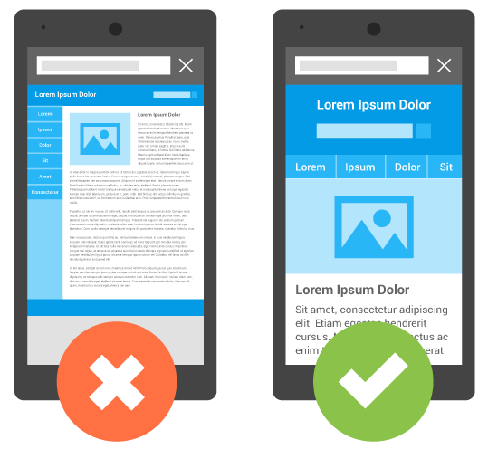
Use a responsive design
When it comes to the design, a clean and focused copy can go a long way. It is advisable to use a responsive design since it makes it very easy for developers to create a site that is very easy to view from any mobile phone. A very busy design can interfere with the website’s ability to load quickly. On the other hand, a responsive design allows webpages to detect the visitor’s screen size and orientation and automatically change the orientation.
Perform tests on different mobile devices
Even after you’ve made a responsive website, it is advisable to test it more than once in different mobile platforms. With that, you will be able to see how it appears on different mobile devices. When testing, it is important to focus on every user actions, page, and buttons.
Work with experts
If you will ask any expert, you will know that having a responsive website design is not enough if you want a mobile-friendly site. You also need to do mobile SEO to make your site more visible on mobile search results. Consult experts offering SEO services in Sydney just like Quantum. Quantum is a digital agency offering web design, web development and digital marketing services all in one. So if you need some help, they’re one of your best options.
Conclusion
Though these may seem to be very small changes to your website, they will be able to do away with your user’s frustrations. With the tips, you will be able to come up with a website that is more mobile friendly.
About the Author:
This article is contributed by Katrina Fernandez.
We are influencers and brand affiliates. This post contains affiliate links, most which go to Amazon and are Geo-Affiliate links to nearest Amazon store.
This is the Dragon Blogger Guest Bloggers account for author’s who want to submit articles and only have credit in the post instead of having to manage their own WordPress profile.